Monday’s zine- What Makes Me Smile, A Guide to Being Happy by Christie Powers
A light-hearted threefold zine, full of hand drawn typography and writing about ways to be happy.
Again all drawn with fine liner (0.3mm and 0.5mm) and coloured with horrible felt pens.


Philomathy
3/Jun/12
The first zine in Zine-A-Day, called Philomathy by Christie Powers.This zine is concentrating on hand drawn typography and elements of illustration. These few shots show some of the words I chose for today’s zine. Eventually, it will be staple bound.
Enjoy and let me know if you want one for yourself, more pictures will be uploaded soon onto cargocollective.
A philomath is a lover of learning, from Greek philos (“beloved,” “loving,” as in philosophy or philanthropy)


Educate Yourself Series (2012)
14/May/12
All hand drawn type, my thoughts on television written on paper, hoping to make a book out of these. Enjoy, lots of new work on it’s way as uni is nearly over. All done with fine line 0.4m pen. More to come soon 🙂


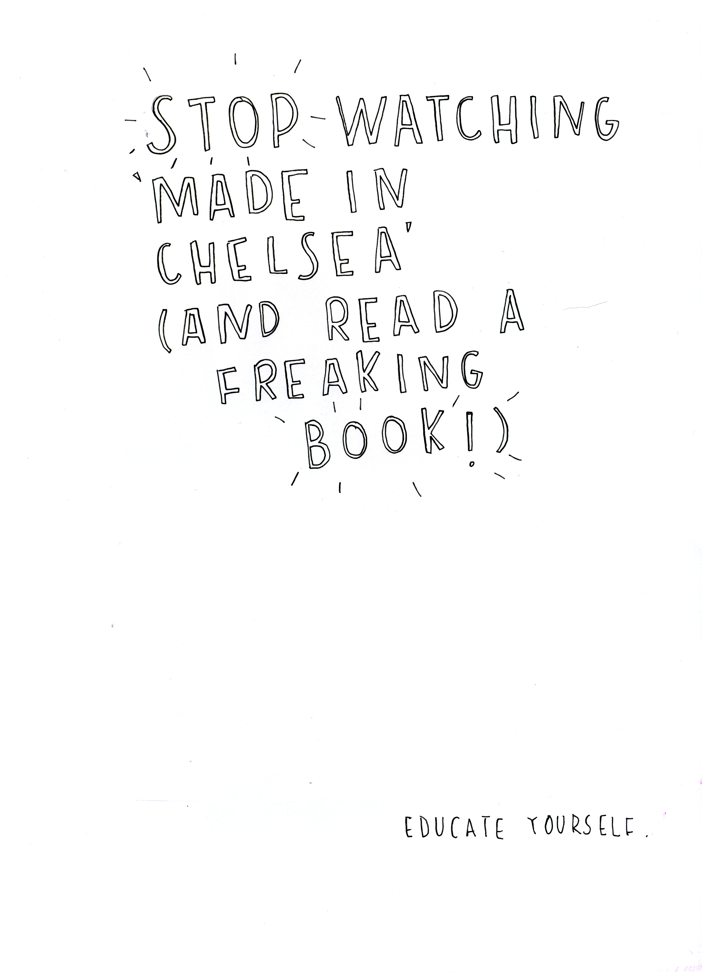
Educate Yourself Series
23/Apr/12
The first of many I hope.
Currently having my facebook and twitter feed full of rubbish about Made in Chelsea so I made this. I am missing doing my typography, there aren’t enough hours in the day! Work, work, work.

Read and enjoy.
All copyrights to Christie Powers 2012.
Let Your Mind Go Wild
11/Apr/12
This is today’s doodle. It began as a bunch of dots, then I turned them into shapes and patterns and incorporated some typography. I made this with my 0.4mm pen on A4 paper, got it onto illustrator and vectorised it. I’m really happy with this and believe it should be seen bigger so I included some close up screen shots. I see this piece as a celebration of shape. I hope you enjoy it.


Peace is the Word
10/Apr/12
An A4 doodle, photographed then vectorised. Originally done with 0.1mm black pen. I’ve included some close ups too. I really enjoyed creating this as once it was finished it reminded me of summer. Hopefully I can experiment with adding colour in the future and maybe some more typography!


Fashion Progress
12/Mar/12


Some more progress on my Fashion Brief, I have to present this tomorrow.
The theme carries on throughout all the merchandise, (poster, invitations, programme cover). My main inspiration came to me whilst looking at the fashion student’s portfolios and the great way of showing their work in scrapbook form. The words we were given to base our work on was Best of British and collage. I didn’t want to be too cliche so I took the colours from the union jack (red, blue and white) and used them in my pieces. I used my sewing machine to sew the lines onto the denim in these colours. The cut out style is to portray the collage and the cut out templates used when making clothes, I also think this style creates an almost grungy and edgy look, especially as I have left the seams and creases on show.
I have really grown to like this piece of work.
Feedback always welcome, much love and light x
Fashion Poster Draft
11/Mar/12

Still needs a little bit of work, this is my fashion poster for my current project.
The aim of this piece is to advertise the Fashion Graduate Show. We were told to base our work around the Best of British, they told us to look at pop art, collage and even the union jack. I used denim for the background and used the sewing machine to feature the colours associated with Britain (red, blue and white). The idea behind the typography is that it looks similar to hand-made templates and cut outs, which is relevant to the templates the fashion students use. I also wanted the poster to be quite illustrative as this is a big part of the fashion course.
The current design still has room for a border but I’m stuck for ideas at the moment, any feedback or ideas are welcome, thankyou.
British Fashion Illustration
8/Mar/12


Here’s some quick fashion illustration I did yesterday the theme is British so I used the colours from the Union Jack. Click the top image to see it closer. Hopefully these figures will feature in my fashion show poster…eventually.

