Recent Work, typographic quotes
29/Jun/12


A new set of lovely quotes all hand drawn with 0.3mm fineliner. Hopefully going to carry on with this for a while and create a lovely collection. I will also try to experiment with colour and digitalising my typography with vectors etc.
If anyone has any good quotes feel free to comment and I will upload it when I’m done 🙂
-Apologies for the watermark at the bottom, the disrespectful people of tumblr have drawn me to this! I don’t mind if people like to share my work but when my link is deleted I get angry. Support new artists people!!!
Monday’s zine- What Makes Me Smile, A Guide to Being Happy by Christie Powers
A light-hearted threefold zine, full of hand drawn typography and writing about ways to be happy.
Again all drawn with fine liner (0.3mm and 0.5mm) and coloured with horrible felt pens.


Philomathy
3/Jun/12
The first zine in Zine-A-Day, called Philomathy by Christie Powers.This zine is concentrating on hand drawn typography and elements of illustration. These few shots show some of the words I chose for today’s zine. Eventually, it will be staple bound.
Enjoy and let me know if you want one for yourself, more pictures will be uploaded soon onto cargocollective.
A philomath is a lover of learning, from Greek philos (“beloved,” “loving,” as in philosophy or philanthropy)


Candour
2/Jun/12
Another collaboration with another very talented and hard-working Documentary Photographer, Denise Fotheringham.
The book has a unique screen-printed cover; is bound together by interscrews; includes an essay; quotes from Manby and stunning tipped-in photographs, all individually hand printed by Denise herself.
Photographs by Denise Fotheringham.
Design by myself.
Made by Mr R Prosser.
Any feedback would be amazing and I’m sure Denise would love to hear what you think as well. Enjoy


Educate Yourself Series (2012)
14/May/12
All hand drawn type, my thoughts on television written on paper, hoping to make a book out of these. Enjoy, lots of new work on it’s way as uni is nearly over. All done with fine line 0.4m pen. More to come soon 🙂


Educate Yourself Series
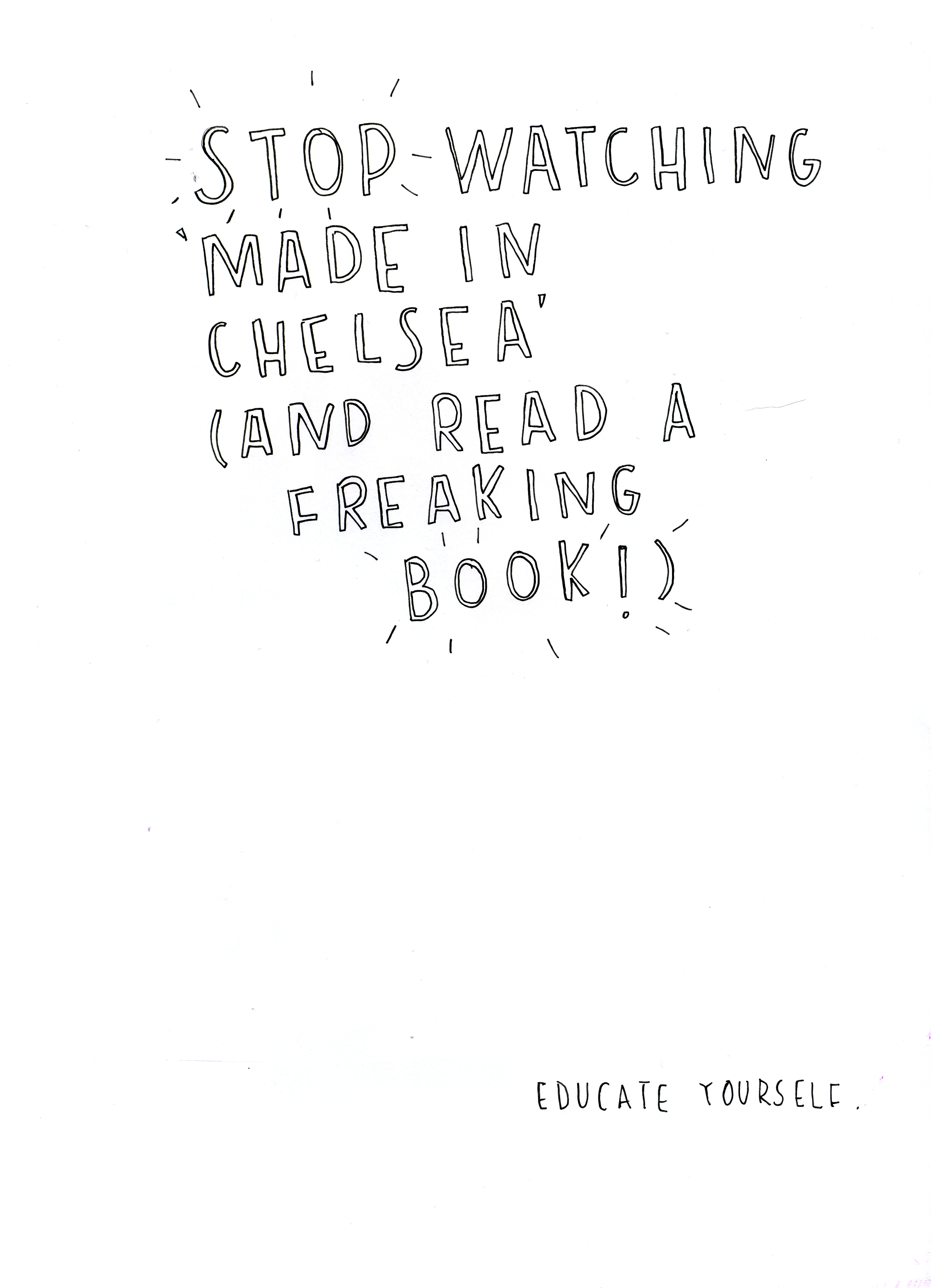
23/Apr/12
The first of many I hope.
Currently having my facebook and twitter feed full of rubbish about Made in Chelsea so I made this. I am missing doing my typography, there aren’t enough hours in the day! Work, work, work.

Read and enjoy.
All copyrights to Christie Powers 2012.
Let Your Mind Go Wild
11/Apr/12
This is today’s doodle. It began as a bunch of dots, then I turned them into shapes and patterns and incorporated some typography. I made this with my 0.4mm pen on A4 paper, got it onto illustrator and vectorised it. I’m really happy with this and believe it should be seen bigger so I included some close up screen shots. I see this piece as a celebration of shape. I hope you enjoy it.


Peace is the Word
10/Apr/12
An A4 doodle, photographed then vectorised. Originally done with 0.1mm black pen. I’ve included some close ups too. I really enjoyed creating this as once it was finished it reminded me of summer. Hopefully I can experiment with adding colour in the future and maybe some more typography!


Sneaky peak at Book Cover Design Part 2
21/Mar/12


A second book design which also includes my very own illustrations and typography, all hand drawn. This project has really opened my eyes to different ways of creating images, whether it’s the media used or the method.
Sneaky peak at Book Cover Design Part 1
21/Mar/12


Some close-up screenshots of my most recent work, featuring my abstract ink work, hand drawn typography and ink paintings.
